Nightride — Building a Brand Around a Danger You Can't See
A ground-up visual identity for an early-stage night-vision device — logo, color system, typography, and a full application suite spanning packaging, out-of-home, and social — designed solo for Wesa, the Brooklyn engineering company behind Nightride.
- Role
- Freelance Brand Identity Designer
- Client
- Wesa (Nightride)
- Scope
- Logo, Color, Type, Packaging, Advertising, Social
- Year
- 2018
- designer — strategy translation through shelf-ready production, start to finish
- 1designer — strategy translation through shelf-ready production, start to finish
- Pantone colors, reverse-engineered from the device's own thermal display
- 3Pantone colors, reverse-engineered from the device's own thermal display
- application formats built from one system — packaging, out-of-home, social, product
- 4application formats built from one system — packaging, out-of-home, social, product
The Challenge
Over a million deer-related collisions happen every year in the US, most of them between dusk and dawn — the exact hours when headlights alone aren't enough. Wesa had engineered a heads-up night-vision device — Nightride — to solve that: affordable, self-installable in ten minutes, built for virtually any vehicle. What they didn't have yet was a way to make people care.
The brand had to work for two very different buyers at once — off-road enthusiasts who wanted the coolest new gear on their Jeep, and parents who wanted their kids to make it home safe. It also had to earn trust fast: a startup asking people to bolt new hardware to their car needs to look like it knows exactly what it's doing.
The Identity System
Logo & road icon
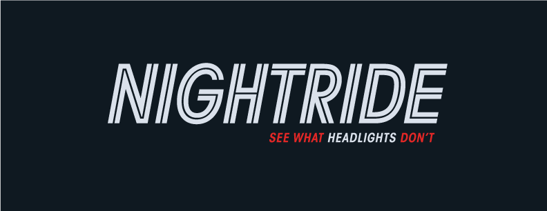
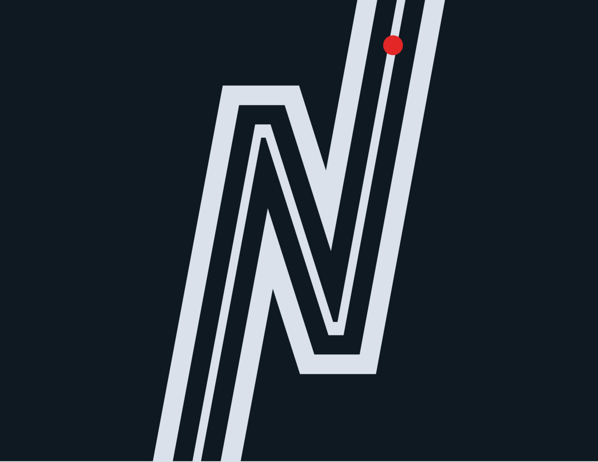
The wordmark uses sharp, italicized linework that reads as motion at speed. Alongside it, a standalone icon built from the letterform N doubles as a literal road marking — two lanes and a shoulder line, with a red dot standing in for a hazard on the path. It was designed to bleed off the top and bottom of any layout, so the "road" always continues past the frame.
Color, drawn from the device itself
Rather than pick colors for mood, the palette came from what the product actually shows you: the red and near-black of a thermal heat-signature display, plus a cool ash-grey standing in for headlight visibility. Three colors, each one tied directly to how the device sees the road.
PMS 485 C
Thermal signature red
PMS 649 C
Headlight ash-grey
PMS Black 6 C
Night road
Typography & tone
ITC Avant Garde Gothic Std carries the brand voice: bold, geometric, slightly aggressive — closer to an automotive performance brand than a typical consumer electronics one. The tagline, "See what headlights don't," does double duty as both a safety promise and a dare.
See what headlights don't.
Bringing the Brand to Life
A brand identity only proves itself once it survives contact with real formats. The system was built to flex across the full range Nightride would actually need to launch.
Packaging
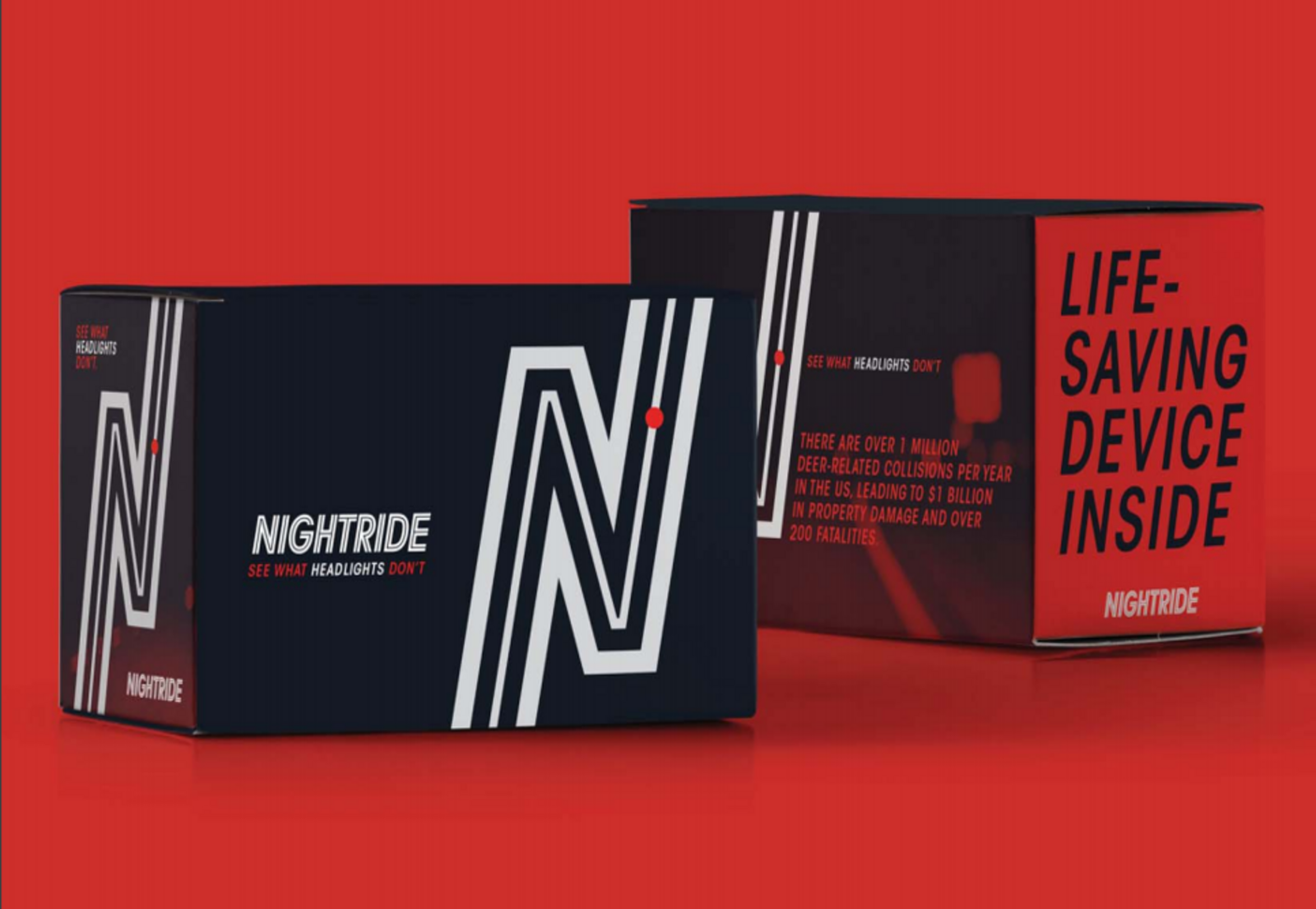
Dual-tone boxes that lead with the tagline for shelf/unboxing moments, and with the safety stat for anyone who needs the "why."
Out-of-home
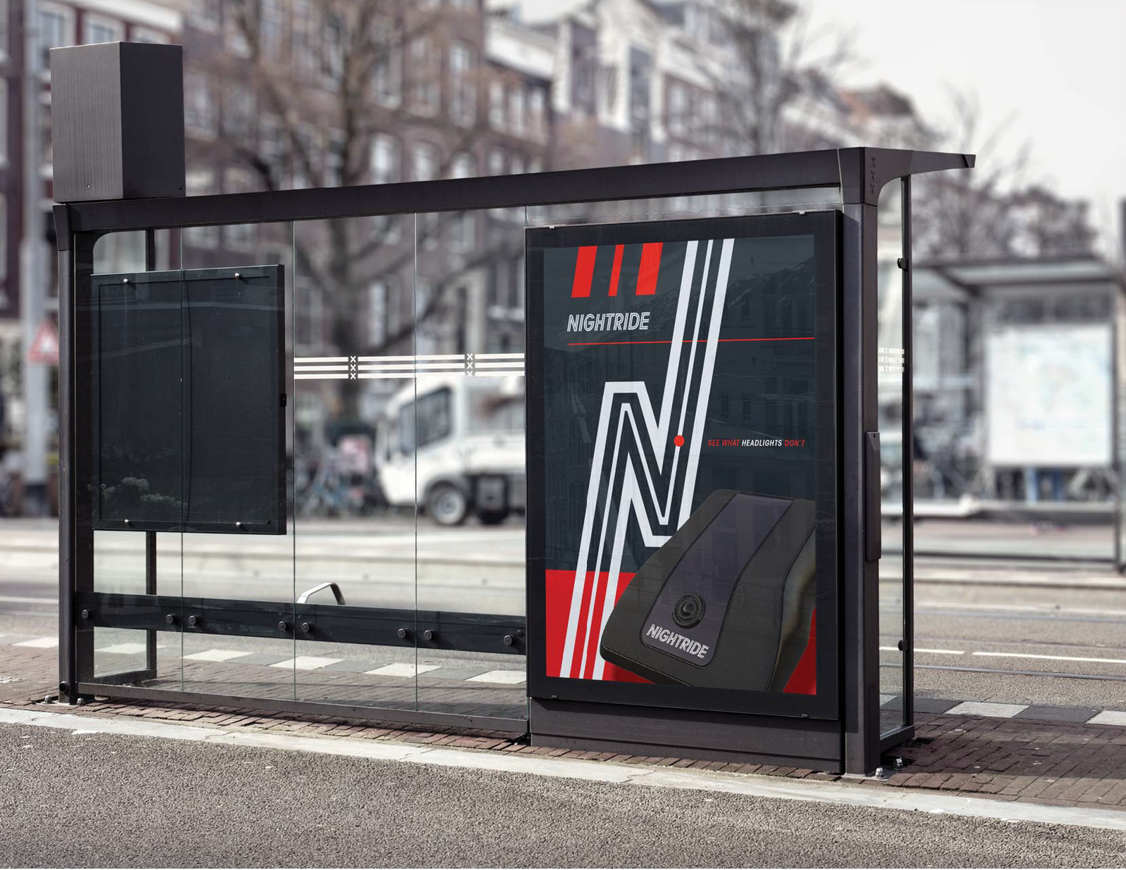
A bus-shelter ad concept translating the identity to high-contrast, glanceable outdoor advertising.
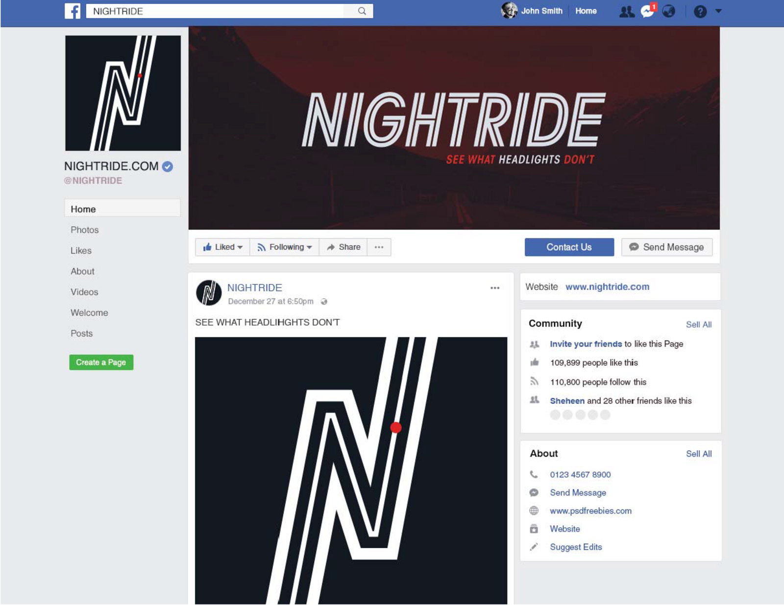
Social
A Facebook page mockup showing how the wordmark, road icon, and photography style hold up in a real social environment.
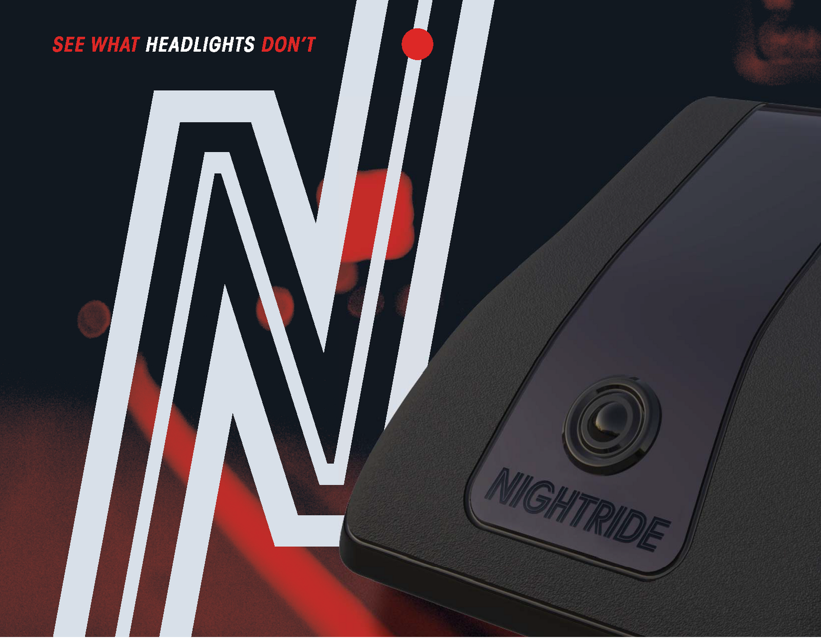
Product
The wordmark applied directly to the physical device, keeping brand and hardware visually unified.
What This Took
What building this identity solo, start to finish, actually required.
One system, every format
Logo, color, and type all had to hold up identically on a product enclosure, a cardboard box, a bus shelter, and a Facebook feed — with no separate visual language for digital vs. print.
Design led by function, not decoration
The color palette wasn't chosen aesthetically; it was reverse-engineered from what the device's thermal display actually renders, so the brand and the product tell the same visual story.
Balancing two audiences in one voice
The tone had to read as "cool aftermarket gear" to off-road enthusiasts and "trustworthy safety equipment" to safety-conscious parents, without contradicting itself.
Full ownership, start to finish
Sole designer on strategy translation, identity design, and every downstream application — from first sketch to shelf-ready packaging.
Where It Is Now
Nightride is a real, growing company today — no longer a single device, but a full line sold through 300+ dealers and agencies, ISO 9001–certified, GSA-listed, and used by police departments, fire crews, farms, hunters, and even combat medics in Ukraine. Their gear has been credited with locating an armed suspect, finding a missing child, and preventing countless deer-strike accidents — and the brand has picked up "Coolest Thing Made in NY" honors multiple years running. The identity has evolved a lot since Wesa's original 2018 launch, but the foundation — the name, the safety-first positioning, the visual language — is where it started.
Next Case Study